Brabantia introduces four new trend colours; Mineral Powerful Blue, Dreamy Blue, Soft Beige & Mineral Cosy Brown. They’re beautiful, but how do you implement these colours in your interior? And what effect does colour have on your mood? Sandra from Finntage, expert in the field of colour (take a look at the beautiful colour explosion in her home), explains to us what colour can do to your interior and to your mood.
"Colours play a very important role in our daily lives. They influence our state of mind and our mood. They can make us cheerful or calm. Colour stimulates us, sharpens our senses and determines whether we find something beautiful. For example, seeing a large meadow full of colourful dahlias on a fine summer's day gives us a completely different feeling than a grey carpool lane along the motorway on a dark day. And that feeling is exactly what colour does to you."
"Create your home, with the colours you feel good about."
Colour in your interior
"We want to feel good at home. So it's important to think carefully about the colours you choose for your interior. It's not just the colour that affects our mood, the brightness and tone also plays a big role. A fresh light blue, for example, has a completely different effect than a deep and intense royal blue. To choose a good colour for your interior, it is useful to consider what you want the room to radiate. For your study you can choose warm colours such as red, orange, earth tones or yellow. These colours give energy and are therefore often less suitable for the bedroom where you want to relax. The colours green, blue and purple are more suitable for this. These colours generally make you feel calmer.”
What colour says about your character
"We know that a house often shows the personality of the person who lives there. But it's not just the style of living or the furniture that reflects your character, as colour also plays a big role. It even seems to be the case that people who have the same colour preference in their interior often have similar character traits. For example, blue stands for reliable and assertive, green for positive and harmonious and grey for neutral and passive."
A wow effect
"Sometimes you see interiors where you immediately get a feeling of 'wow'. It's often difficult to say why, but you just feel that the interior is finished. If we look at why an interior has this effect, it is often the balance in colour. The right use of colour creates a unified home and brings a space into balance. This balance is achieved by not using too many of the same colours, but also not using too many different colours in a room. It is often the details that make the difference. Think for example of accessories in certain colours or materials in a matching colour."
A new colour palette without painting
"I regularly get the question of which colour works best in a certain room. There is no simple answer to this. It is all about what atmosphere and feeling you want to create with colour. By playing with your own favourite colours in your interior you can give a very personal touch to your home. A splash of colour can make all the difference and with Brabantia you don't even have to paint to do it."
"A splash of colour can make all the difference, and with Brabantia you don't even have to paint to do it."
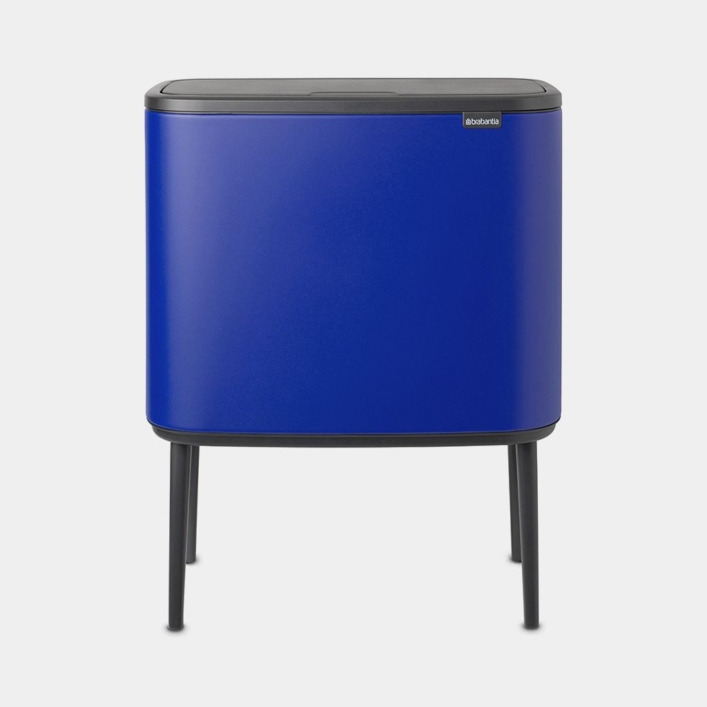
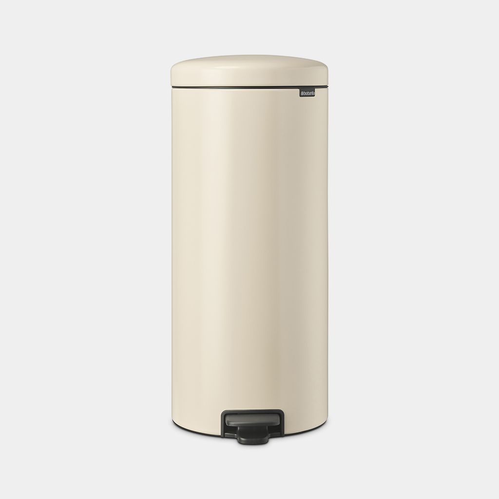
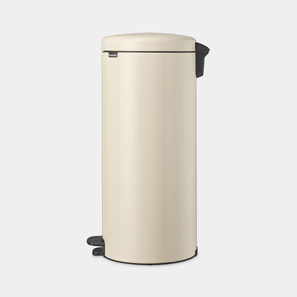
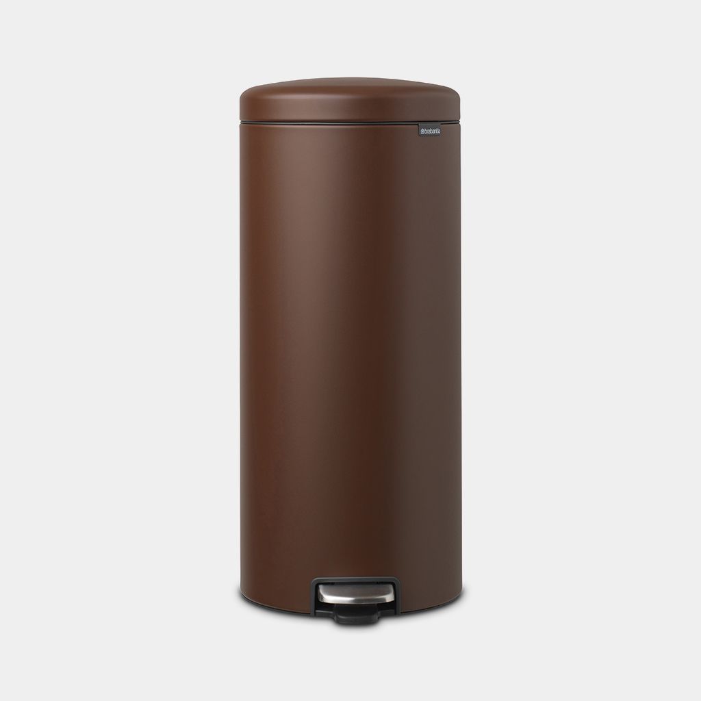
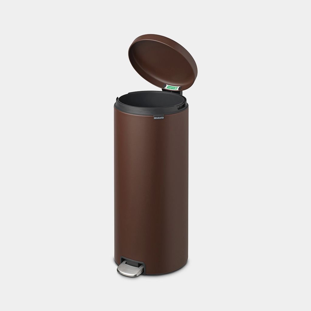
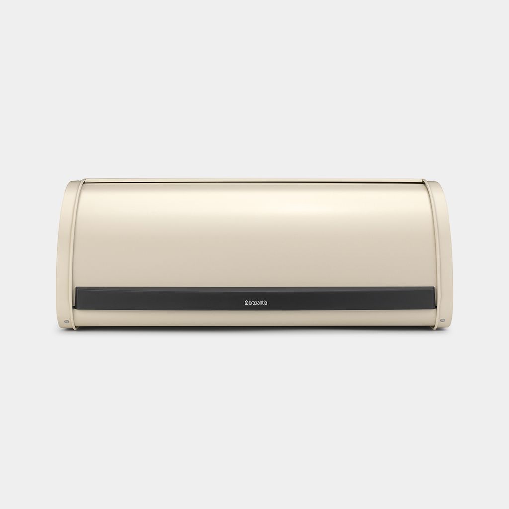
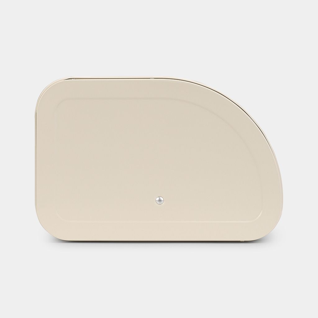
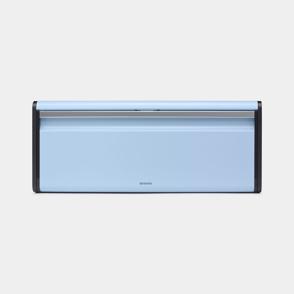
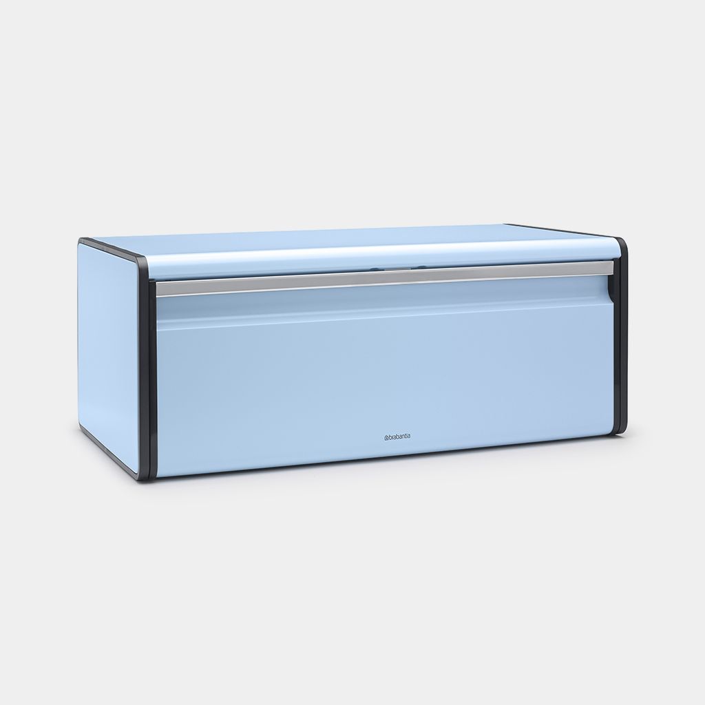
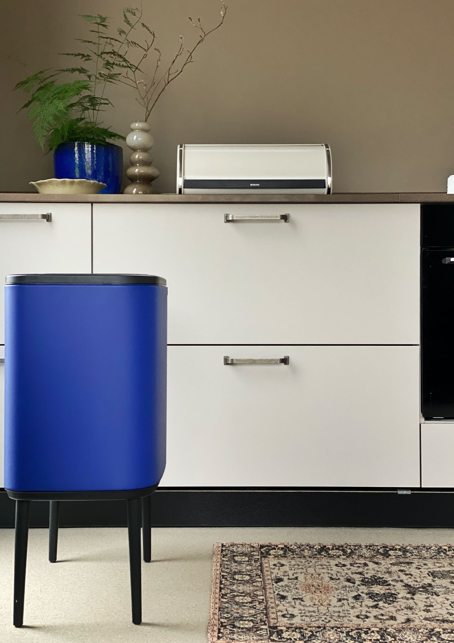
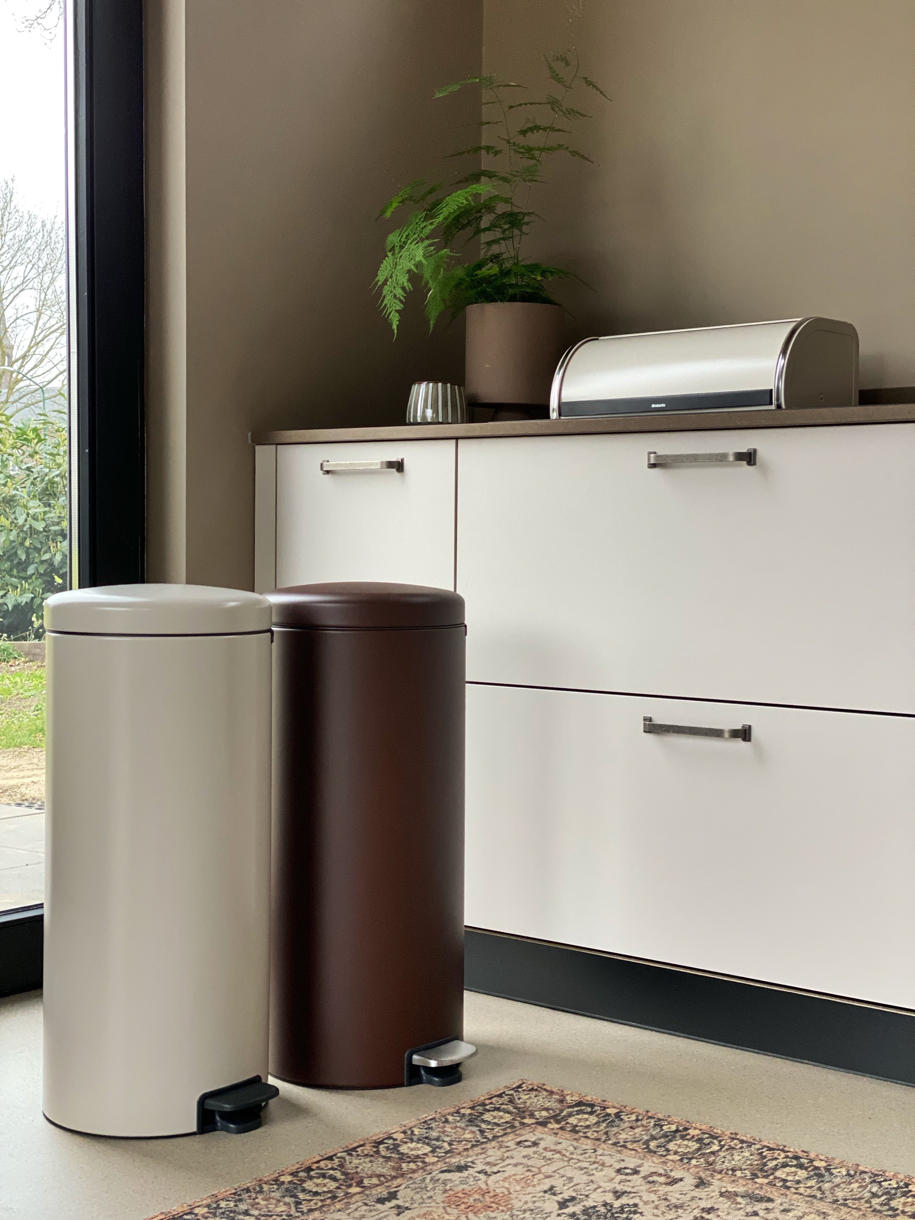
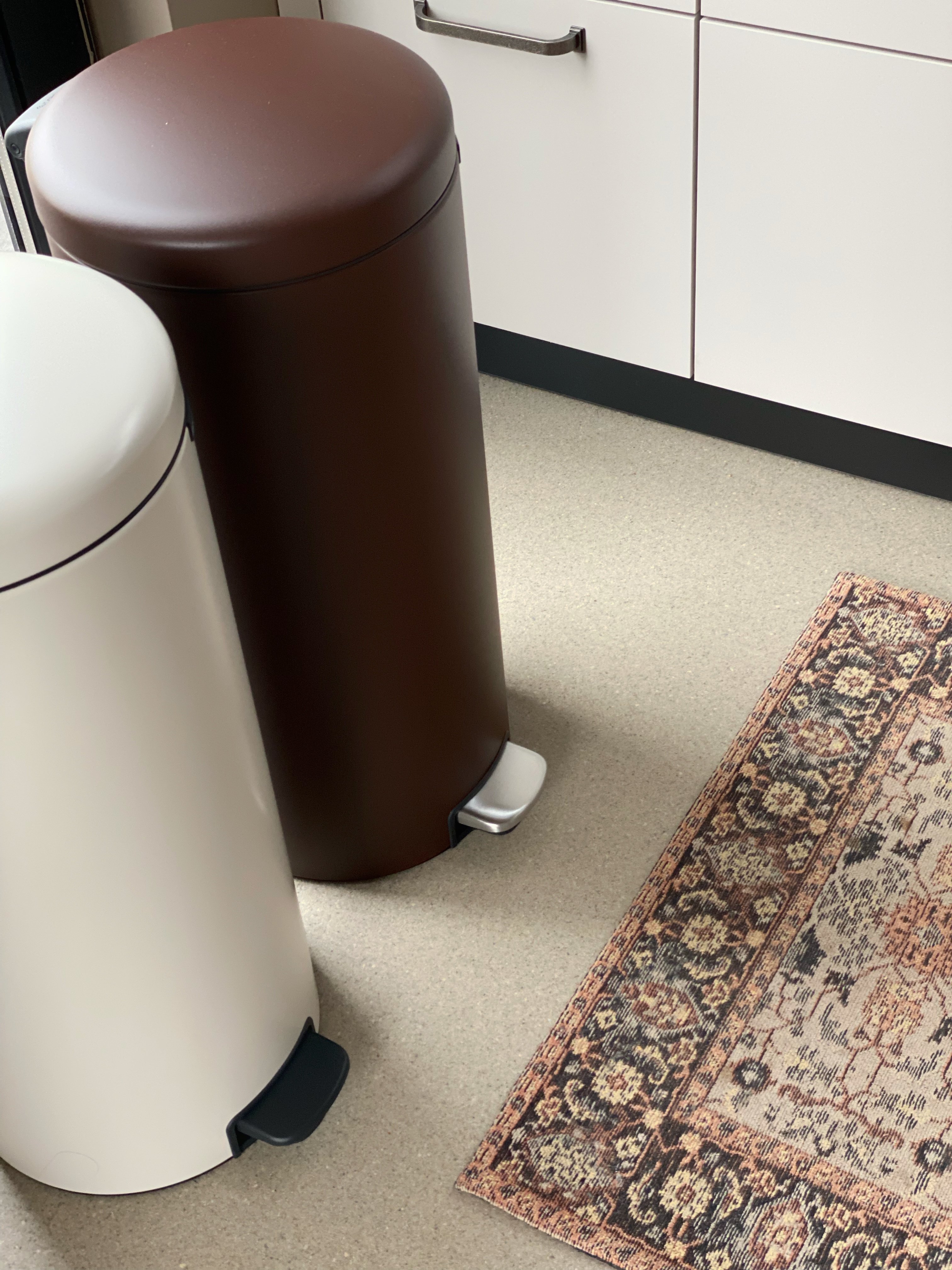
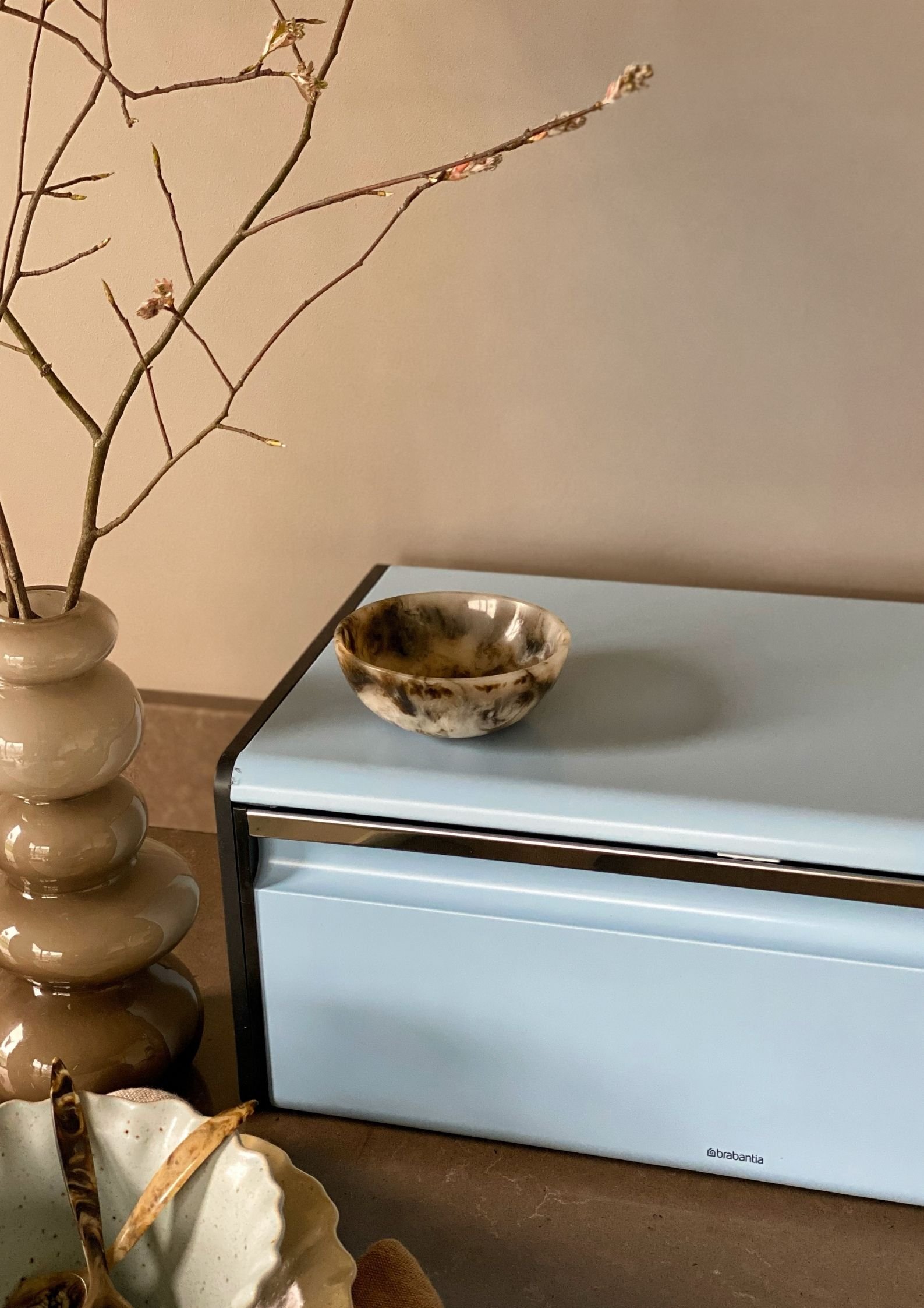
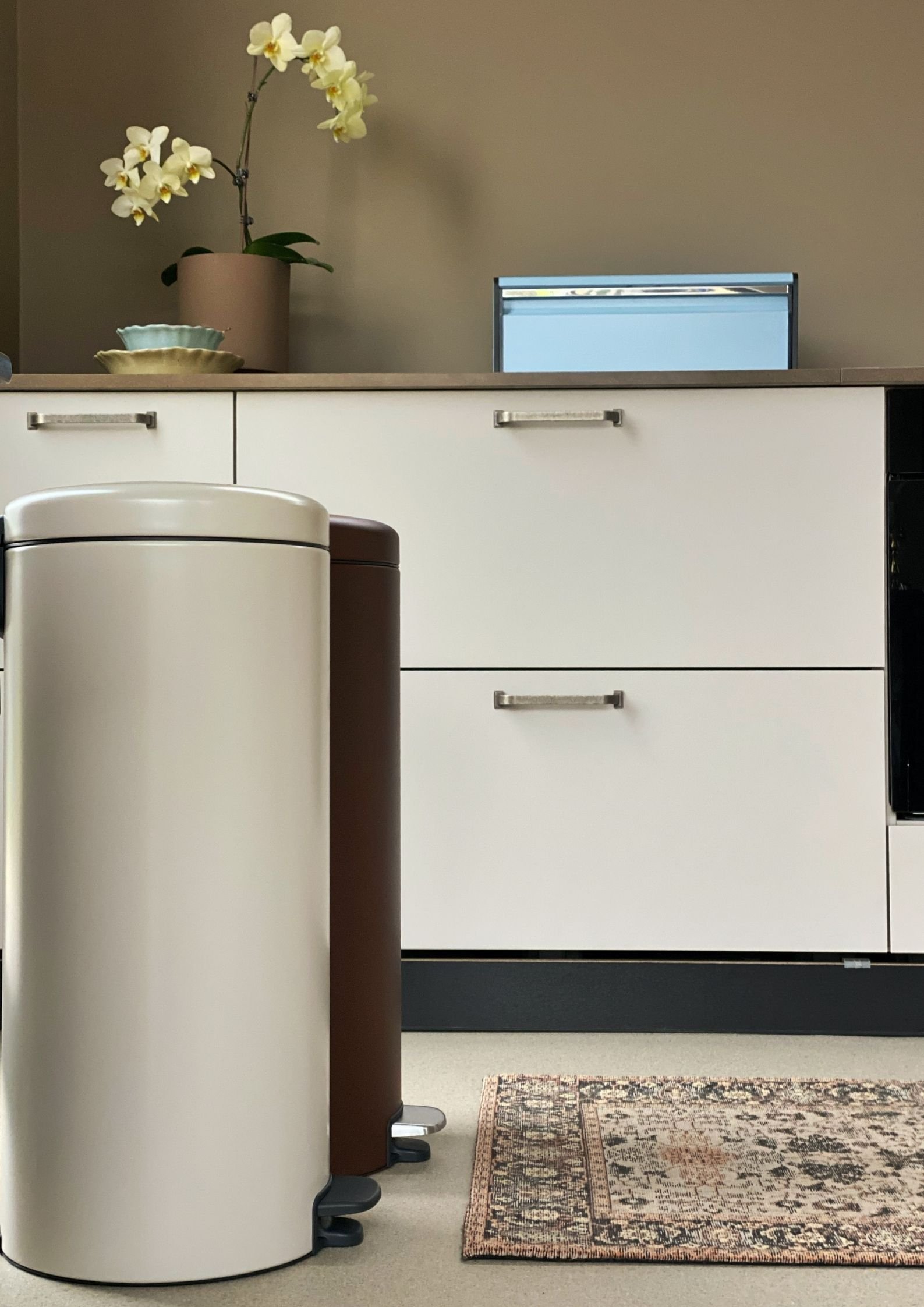
Brabantia's trend colours
"Brabantia's new colours appeal to all aspects of your personality and life. The relaxing Soft Beige fits into any interior and adds a harmonious feel to the room. The crisp Dreamy Blue feels fresh and free, an instant dose of optimism. The popping Mineral Powerful Blue stands out and makes you feel powerful. And stylish Mineral Cosy Brown is both warm and down-to-earth. Brabantia understands that practicality can also be beautiful. Colour makes your day and your days should be beautiful!"
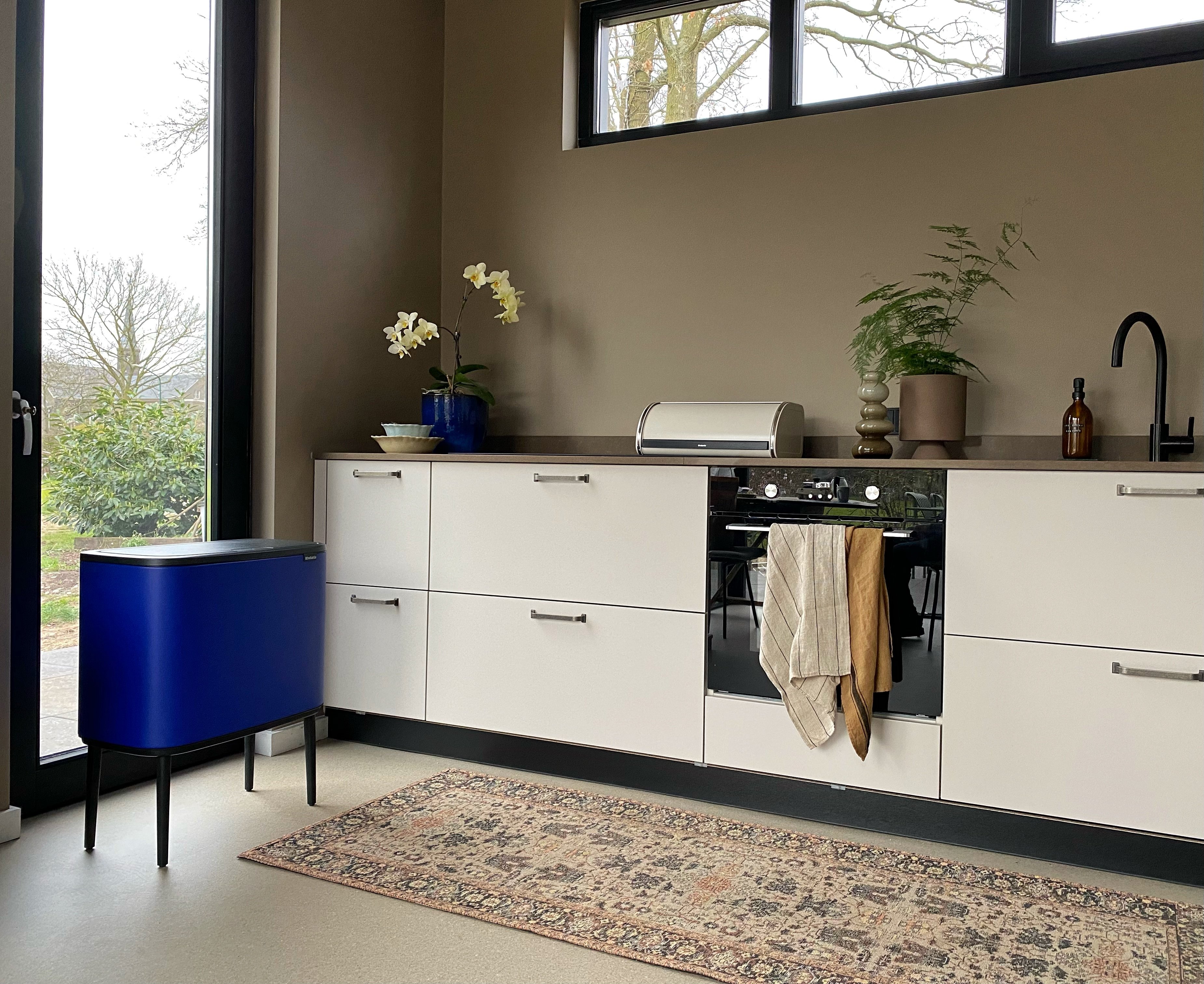
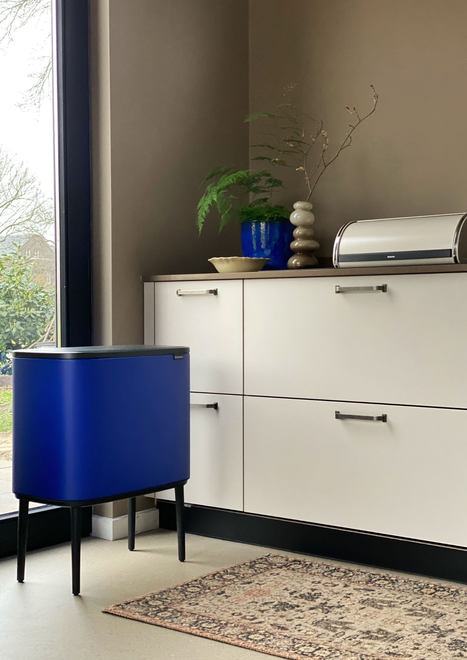
Combine it!
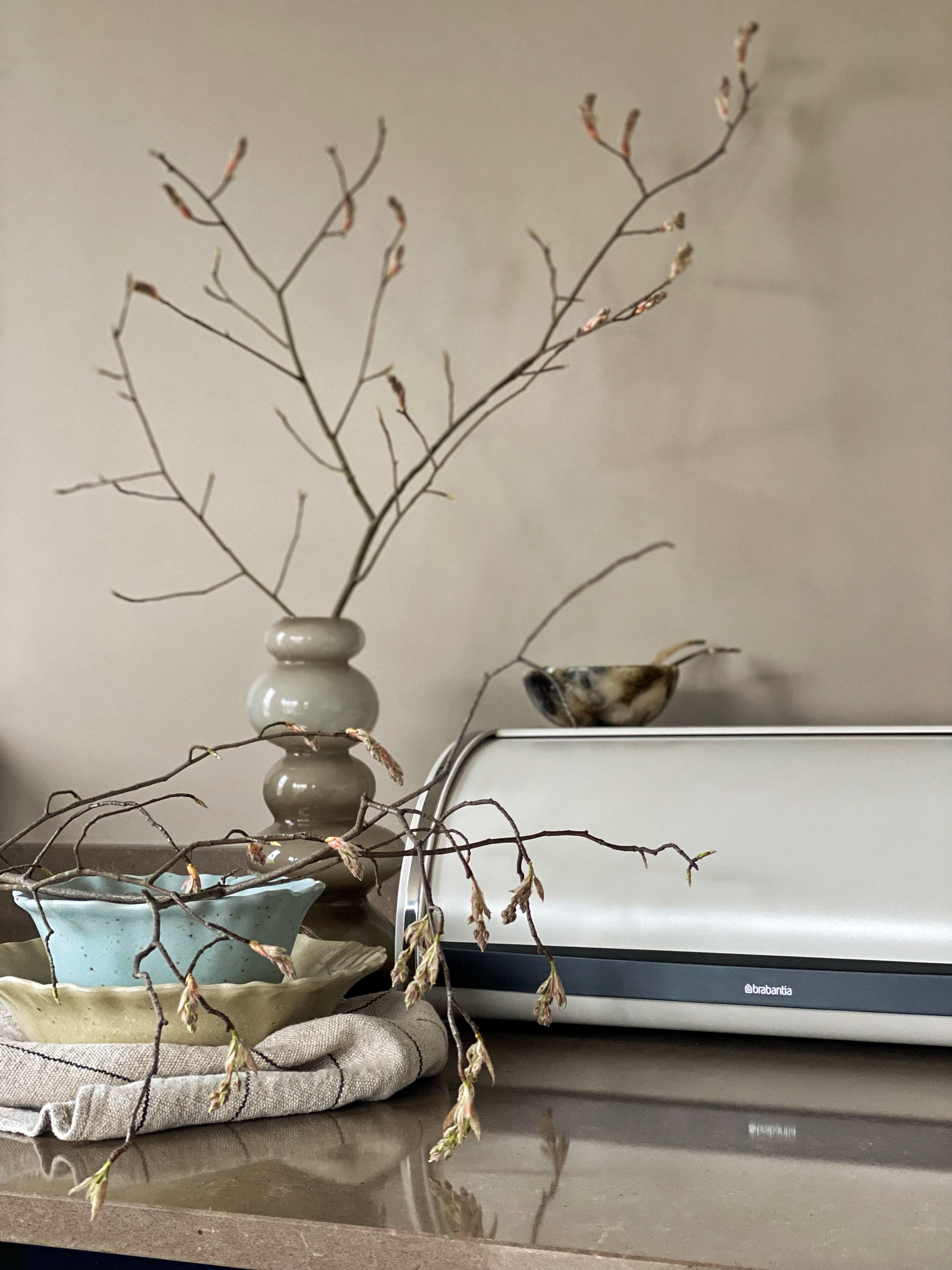
"For Brabantia I got to work styling this kitchen with the new trend colours. Certain choices in colour details give a completely different overall picture: if you combine two similar shades such as Mineral Cosy Brown and Soft Beige or Mineral Powerful Blue and Dreamy Blue, the overall picture is one of calm. Mineral Powerful Blue is also perfect as an accent colour in a quiet kitchen and is also beautiful in combination with Mineral Cosy Brown. What is ideal about this collection is that it is very easy to combine together, so you always have a combination that fits your interior!"